Before this course I was a complete novice and apart from using an instamatic camera I knew hardly anything. I had never used a DSLR before. The first couple of weeks I was excited by the challenge but then missed some of the course because of a prebooked holiday to America. I did take my camera with me and tried to experiment with what I had been taught to date. America is an ideal opportunity for a photographer and in Arizona the weather lends a perfect clarity to the views. Arriving back home and attending a couple more sessions I became a bit overwhelmed and wondered if I had taken on too much, being behind and all. However I decided to bite the bullet and take one step at a time. Gradually I began to get a feel for the camera and what we learned in the lessons began to make sense. As I started to understand the mechanics I began to relax and enjoy myself more. The main concern I had was matching up the Aperture and Shutter Speed, but I kept on persevering and eventually it clicked.
My final pieces were based on Woodland and Trees. I have an affinity with woods and find them timeless and tranquil, although they can also be forbidding and mysterious places. It was enjoyable to travel around and find different scenes to photograph. I was going to base my work solely on these aspects but having seen the work of Josh Sommers and Helen Sears I decided to utilise portraits of girls superimposed on to the trees to give an added nuance. Helen Sears' work is very delicate and she uses layers incorporating female heads and lace. This gives it a very haunting feel to the photos. Josh Sommers run along a similar theme but are more powerful and direct and clearly uses photoshop to manipulate them. I feel that the faces enhance the mystery and serenity of the woodland photos without detracting from the basic imagery.
Before each of my travels I ensured that I had the correct attire, trying to cover every contingency as well as a fully charged battery, enough space on my memory card, my tripod and my cameras manual. I would plan before hand the area that I wished to view and would make sure that I had my map available. The camera that I used was a Nikon D3100.
Problems that I encountered were mainly logistical, finding places that allowed a photographer to set up in safety and in public places. So many beautiful shots are positioned on a hairbend with no parking signs and traffic going at an amazing rate. Once or twice the days that I went hunting for good photos were also days that had gale force winds that stung the face and turned fingers to ice, let alone causing the tripod to shake dangerously making photography impossible. Solving these problems meant taking more journeys back to these places and investing in good quality gloves.
When I first started taking the photographs it was largely experimentation and trial and error but gradually I had a feel for Composition, Aperture, Shutter Speed, ISO, White Balance, Focul Point and Depth of Field.
Overall I am pleased with the outcomes of the work although I always think I could do better. You can never have enough photographs to choose from, so I have learnt that always having a camera at hand and using your eyes to see things in a new light is beneficial. I found it difficult trying to choose a theme within the context of Landscape. I do tend to be quite indecisive and I think sometimes it's better to make a decision rather than floundering around. The other problem was finding the focul point. If there was a path or a clearing in the wood it was easy, but if it was just trees and vegetation it was hard to get a focus. Photoshop almost floored me, I did find it quite difficult to come to terms with but after having some instruction and a lot of playing about I started to get the gist of it. This I feel is going to be an ongoing journey.
I have enjoyed this course thoroughly and I am looking forward to taking it further.
Monday, 30 January 2012
My Final Four Manipulated Images altogether.
I based my manipulated photographs on 'Time', because we had to chose a theme to link them altogether. Each photograph says something about the passing of time. Two of these photos are in a serious vein and the other two more humourous.
I started off by looking through my photographs to see if any would be good as a base and then wrote down a series a sayings about time. I then planned on paper ideas that I could use. Some of these I discarded and I was left with four ideas. This was the easy part. Getting to grips with photoshop proved more of a challenge, as the computer at college was an Apple Mac and the layout is quite different to my laptop at home. Also I could only afford to buy the Photoshop Elements and therefore I only had the basic tools at hand. I still found the layout pretty confusing. It was only with a great deal of experimentation and perseverence that I got to grips with it.
The equipment I used was my Nikon D3100 Camera, my tripod, a fully charged battery and lots of space on my memory card.
On all the photographs I have used various layers and used The Quick Selection tool and the Magnetic Lasso tool to lift the props from photographs. I have also used the blurring technique, distortion, perspective, Skew and Scale to position things appropriately in my pictures. On some of the photographs I have played around with Opacity, Saturation and Monotone.
Eric Johansson, an artist whose work I enjoyed, influenced my western photograph. His work ranged from clever to humourous and is always thought provoking. I enjoyed the fact his pictures are quite surreal and I have tried to get the same effect in my pictures. Another artist whose work I liked was John Goto. His style is like collage work where he brings things together to make a quirky photo. This influenced in particular my 'Time of Their Lives' Photograph. I found his style to be quite light hearted and as I like collage as a craft in itself I was interested to combine this with photography.
On the whole I am pleased with my final manipulated pieces especially as I had never used photshop before. I had a distinct learning curve and am quite proud that I managed to come through it and now I don't find it so scary. I found that manipulated images really awakens your imagination and I look forward to experimenting on a larger scale. As always, when I look at the photographs I always feel that I could have doen better but I feel that will always be the case. Manipulating Images is quite time consuming and it is easy to get carried away and very difficult to know when to stop. Sometimes it ios a case of less is more.
Here are my four final images:

'Winter Time'

'Tempus Fugit'

'Time of Their Lives'

'Sands of Time'
Fantasy Landscape Number four (Manipulated Image).
For my fourth image I decided to use some of my american photgraphs with the idea of time passing from the cowboy era to today. Before manipulating my final image in photoshop, I used to Picasa to chnage the colouring to sepia. This gave the photos a more aged look.My first layer ( the background layer ) was a picture of part of an old western town looking our onto the horizon. I then added another layer containing a modern day cowboy in role play. I lifted him off another picture by using the Quick Selection tool and then copy and pasting him onto the second layer. Also I used the blur tool to smooth in the edges so he was more moulded into the picture. I used the same method on the next three layers containing the egg timers. I rescaled and used the opacity to get a transparent look. Finally I flattened the image.

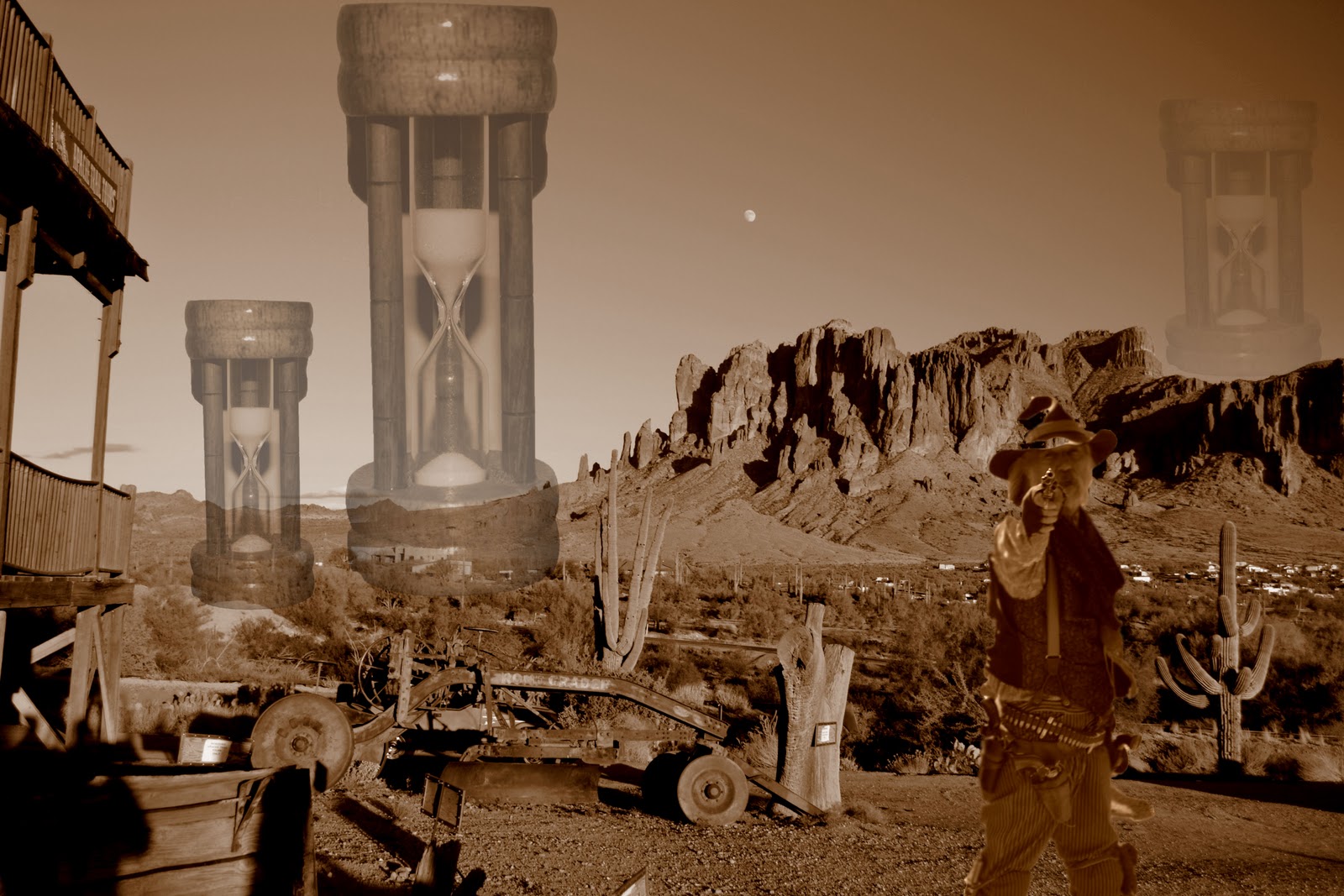
'Sands of Time'
I liked this picture until I added the Egg Timers. I think that the wooden surround is too heavy therefore the egg timer bit doesn't come to the fore. Egg timers are quite difficult to get hold of these days and I could not find one with a finer surround. Being restricted to photgraphing our own props made this quite difficult. I still like the idea of this photo but am dissatified with the main prop.
My final Images.
I had difficulty deciding what to do for my final images. I kept changing my mind and fluctuating from images of forests/woodlands to juxtaposing my american images with those taken in Britain. I've had many outings taking pictures of forests and landscapes but still was no nearer to deciding. It was only when researching various photographers that I came across the work of Josh Sommers and Helen Sears. I loved their work and felt really inspired. Although they had similar themes i.e. faces superimposed upon pictures or vice versa, the effects were quite different. Helen Sears' work is more ethereal and delicate whereas Josh Sommers' work uses stronger colours and is bolder. Most of Helen Sears work shows the back of people heads as though they are looking towards the view and as though you, the viewer is looking towards the view. I decided that I would like to use them both as my muse and was lucky that I had two people willing to sit for portraits. I wanted the faces to be almost incidental to the background, a case of the viewer being viewed.
Having collected both sets of images I experimented with layering one on top of the other and altering the opacity so that both pictures could be seen. I also used the overlay effect and also played around with the colours and contrasts. I cropped all the images to square format as this is the shape I envisioned for my presentation. I duplicated the six images into black and white and then altered the tones. So altogether I have twelve images. I did this because it alters the mood and gives it a softer look similar to Helen Sears.
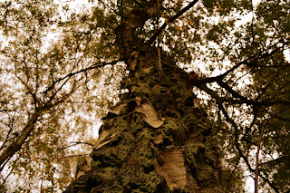
Here are the original photos of trees I used:


Having collected both sets of images I experimented with layering one on top of the other and altering the opacity so that both pictures could be seen. I also used the overlay effect and also played around with the colours and contrasts. I cropped all the images to square format as this is the shape I envisioned for my presentation. I duplicated the six images into black and white and then altered the tones. So altogether I have twelve images. I did this because it alters the mood and gives it a softer look similar to Helen Sears.
Here are the original photos of trees I used:

Shutter Speed: 1.3 Sec F/10 ISO: 100

Shutter Speed: 10 Sec F/22 ISO: 100

Shutter Speed: 1/125 Sec F/7.1 ISO: 400
( I used this image twice, but cropped a different section on the second photo )

Shutter Speed: 1.3 Sec F/5.3 ISO:400

Shutter Speed: 1/60 F/5.6 ISO: 100
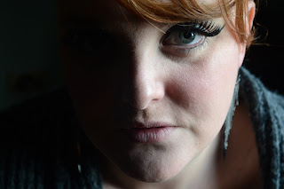
Here are the Portraits that I used:


Here are the trees and portraits combined in colour:


Here are the pictures converted into black and white:


You can see from the above pictures how the work has evolved and how the images created become more mysterious and tranquil. I enjoy the effect of all the photos, coloured and black and white although the coloured ones are my favourites because I like the mood that they inspire.
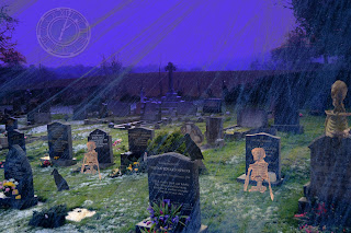
Third Manipulated Image.
Here I am again with another manipulated Image. I have decided this time to be a bit over the top. I have always had a soft spot for the old horror films with Chistopher Leigh and Vincent Price. They always had a theatrical humourous side and were very tongue in cheek. I have taken some photos of our local graveyard and also purloined some halloween items from our pub and took photographs of these to use as props. These included small plastic skeletons, a crow and a clock.


'Time of their lives'
First of all I used the graveyard shot as the first layer and I changed the colour in Picaso to make it appear to be twilight. I also sharpened the image. I then opened up the photo in photoshop ready for manipulation. I set up the skeletons in a pile of soap powder so that when I took the photograph it would appear that the skeleton was rising out of the ground. The soap powder would not be seen once I had used the Quick Selection Tool. I also took single photographs of the crow and the clock. I positioned all of these props using seven layers making sure that I set them to scale. I also used the opacity tool on the layers of the clock and skeletons to make them look more ghostly. The last layer that I used was a close-up of a picture of a large fake cobweb that I had previously taken from a halloween party. I placed this image onto the whole of the background image to give an eerie aspect. It almost looks as though you are looking through a veil. I also used the Opacity tool so you could see through to the background layer and then after some experimentation I used the exclusion effect.
This manipulation still had the theme of time so we used the clock as an ongoing reminder.
Saturday, 28 January 2012
Presenting my work with no limitations.
Given free reign the way that I would like to present my pictures would be inkeeping with their ethereal and surreal nature. Rather than having them hanging on a wall I would have them superimposed upon large semi-transparent material suspended from the ceiling, with each picture curved into a semicircle and at different angles to eachother in a low lit room (not pitch black) , each one being uplit. This would give the sensation of becoming one with the photo. I would also like there to be a very gentle breeze to make the material sway slightly. I feel this would add to the dream like quality. Sound such as birdsong, babbling brook or the whistling wind piped in as a gentle background noise would add to the atmosphere.
I feel that this way of presenting the work would allow people to feel as though they were actually standing within the picture which would be of a life like size.
The location I would choose for my presentation would ideally be in a large building such as a dock side loft with all four walls being made of glass. Viewing would only be allowed at night when it's dark. This would allow the photos the feeling of having no boundaries. There would be nothing to distract the viewer and it would give the impression of being in the open air. In a perfect world I would have the restriction of only one person in at a time to make it a truly personal experience. I realise however that this would not be practical on any level due to time and that very few people would ever get to see it.
Monday, 16 January 2012
Fantasy Landscape (Manipulated Images).
After a few disappointing attempts at photoshopping, I finally came up with another time related idea that I could work with that fits in with my theme. My grandfather always used the phrase 'Tempus Fugit' (Time Flies), so this is sort of in memory of him. I chose a picture of two small boats on the sea with an atmospheric sky above. I enjoy crafting and at the moment I love the Steam Punk genre. I found some metal clock faces and wooden wings and decided to take photos of the two together. This rather looked like birds. My idea was to have the birds flying towards the viewer being smaller in the distance and gradually getting larger towards the foreground. I was a bit dubious at first but having looked at the finished result I'm quite enamoured. I also enjoyed the manipulating and started to understand what I was doing more. I wasn't so afraid to use the different photoshop tools.


'Tempus Fugit'
First of all I started with the background layer which was the ships on water and then used another four layers for the individual clocks. On each of these layers I used the Quick Selection Tool to pick up the outline of the clock/birds. I then manipulated each one by using the tools such as Skew, Distort and Perspective. This gave the effect of birds flying into the front of the picture from a distance. To perfect the picture I played around with the scale and position of each bird/clock. I decided to have the closest one slightly off view to make it more lifelike. I then flattened the image so I could save it.
It might have been a good idea to have had a few extremely tiny birds in the background to give more depth, but then I was worried that you may not have been able to see the clock faces. The original picture was quite a simple comprising only sky and sea with just a few boats in the distance so I'm glad that I kept the bird/clock idea quite simple as I feel that in this case less is more.
Tuesday, 10 January 2012
Moon.
Okay I get home from work one night and realise the moon is almost full and it would be a shame not to use this as an opportunity to take some shots through the trees in the garden. Considering I'm thinking of going with the whole 'Trees/Wood' theme for my final six photographs, it seemed silly not to. I hadn't really taken any night time shots, so it was also a test to make sure I got all the exposure, ISO working well. The only problem was getting the right angle, as the moon was quite low, which looked great through the branches but it also meant that the lawn may be seen on some of the snaps. Obviously I could crop this...but then the moon seems a bit low. Anyway...I experimented...


F/5.3 Shutter Speed: 3 Sec ISO: 800

F/4.5 Shutter Speed: 3 Sec ISO: 800
Here I cropped one of the photos I took as there seemed to be to much going on. The trees in the foreground need to be chopped down...If I had the full Photoshop instead of Photoshop Elements, I would try get ride of the fir trees and just concentrate on the silhouetted ones in the background. I also changed this photo to black and white as the clouds seem to stand out more.

F/5.3 Shutter Speed: 6 Sec ISO: 800
I have manipulated the colours on this image and also cropped it. I decided to cut out the trees in the foreground and also just focus on the branches of the trees in the corner. I also got rid of the moon on this one. I like this photo as it is fairly abstract and it reminds me of a map. It also reminds me of a barren Planet such as Mars, or a dried up river bed.
I used my tripod for all of these shots as it was impossible to take decent pictures in Manual Mode at night without slowing down the Shutter Speed, and for this I had to use the Tripod so camera shake was avoided. I do quite like these shots. If I had to change them in any way, I wish I could have got the moon more sharper. I did try and do this by trying to get the focus right...but for some reason it does come out as a blurry light instead. Maybe I would need a different lens for this.
Monday, 9 January 2012
The Light Task...
As I was going through the checklist for the course I realized that I had not uploaded 'The Light Task' task as I was on holiday at this point. I enjoyed this task but found it harder to take photos whilst it was dark. For some reason it tended to blur more, even though I tried to play around with the ISO.
I chose to shoot at the front of the house as it is quite an open space and thought I may be able to capture some nice skies in the process. Luckily it was quite a fresh, bitter morning with no fog or mist covering things up.


I chose to shoot at the front of the house as it is quite an open space and thought I may be able to capture some nice skies in the process. Luckily it was quite a fresh, bitter morning with no fog or mist covering things up.

F/3.5 Shutter Speed: 1/10 ISO: 200 Time: 07:10

F/8 Shutter Speed: 1/60 ISO: 200 Time: 12:00

F/5 Shutter Speed: 1/13 ISO: 400 Time: 16:02

F/5 Shutter Speed: 6 Secs ISO: 400 Time: 18:00
I found playing with the ISO quite fun, but it can make your photo look totally different. The last photo I actually took in pitch black, but somehow it has managed to make quite a detailed colour background. I do quite like it as I could not really see the clouds. But still, the last picture tends to have a blur on it. As I could not really see whilst I was taking the picture I could not get the focus sharp. I think I maybe should have upped the ISO on the last photo to maybe let more light in. I would like to try this task again some time with using a lake to see how the light reflects.
Fantasy Landscape (Manipulated Image) Oh dear.
Okay...So far I am no good at this Photoshop world, and I'm feeling pretty dumb. Normally I'm quite good at the technical stuff, but for some reason me and Photoshop just don't click. I've watched numerous tutorials online... I've spent hours on it trying to work it out, then given up as I realise it's two in the morning. I have Photoshop Elements 10 ( soon I hope to get the real deal, but need to figure this one out first).
Anyway...after a very stressful five hours, I managed to do just one photo. As we needed some sort of theme that links the four fantasy landscapes photos together I decided to choose 'Time'. This may change. But I needed to just put something to play.
Recently it snowed and I managed to capture a photo of the trees late afternoon with the sky highlighting the background. I have a thing with silhouettes and the branches stand out against the sky so I had a play around to see how I could manipulate the photo. I have not done much and it may not be effective, but here goes...

'Winter Time'
I got this effect by using Layers. The background layer being the trees, the second layer being the clock. I took a picture of the clock, then on photoshop I used the Magnetic Lasso tool to outline the clock and copied it onto the layers. I then went onto 'Image' at the top and selected 'Resize' on the drop down menu and then clicked onto 'Scale' to change the size of the clock. I then moved it so that it was in the position where a moon should be. I then changed the opacity so that it became a little transparent and so the branches stood out against it. I decided to use 'Time' as the thread as I thought it was an interesting concept. There are lots of sayings and Quotes about time so I decided to use these for the titles of the photographs.
Friday, 6 January 2012
Ways to present your work.
There are many different ways in which to present your work but before you even think of doing this you have to take some time and consider how you can improve the work that you are going to display. It is not enough to merely have a selection of photographs. You must choose the photographs that will show your best work. Your display might have a theme or it might be a selection of random work. By paying attention to detail you will be able to present your work in the best possible way.
Editing your work
Ways of Displaying your work
Portfolio - It is vital to have a portfolio of your work as it is always at hand and easy to transport. It's an easy way to allow both yourself and your work the greatest exposure. A portfolio is a case with different sections into which you can place your work. It can be large, medium or small depending on your chosen work and can also contain different information on the different photos. It's waterproof, zips up and is easy to carry having a handle. Portfolios can be presented on CD ROM, DVD, Video tape, Websites, Web Gallery as well as the traditional way. You should only include the cream of your work. Make sure that your most excellent photos are at the front and the back with your other really good photos in the middle. This way the examiner will come in on a high and go out on a high.Your portfolio should be targeted for a specific market.
Books - Using online services such as Blurb and Photobox you can have all the tools you need to make your own photographic book. This way you could add other artwork and text if you so desired. With this service you will get bookstore quality printing and binding. You can choose hard cover or soft cover, and an array of sizes. As well as using this service to show your work you can also order in bulk for selling on to whoever you want to.
Handmade/Handprinted Books - For those people who are both artistic and creative they might wish to handprint their photographs and any written work and present them in a handmade book. This could be a book that is handbound in the general way or a book that shows the inventiveness of the photographer.
Vistaprint - This is another online service whereby your photos can be transferred onto calendars, notebooks, postcards, diaries, keyrings, posters, T-Shirts etc.
Framed Prints - It is important to choose frames that will compliment your work. These can then be hung in a exhibition centre or gallery. It is best to keep frames simple so that the emphasis is on your photos. Position of prints on the wall should also be taken into account, for example, do you wish to have one long line of prints, a random display or set in squares etc...
Galleries/Exhibitions - This is a good way to get your work seen by people who maybe come your clients. Exhibitions can take place in Galleries, Art Galleries, Craft Galleries, as a adjunct to an art shop. Libraries will often show peoples work. Ohter places might include Churches, Community rooms, schools, Museums, Village halls and craft shops etc. These are all Grist to the mill. The one drawback about galleries is that it will appeal to people who are already interested into your type of work but not necessarily to the general public who might feel that such places are above them.
Prints - This is one of the main ways of showing your work and these can be displayed in many ways. They can be sold via the internet using websites, blogs, Flikr. Prints can be in various sizes and shapes and can be sold as they are or framed and used in many different ways. They can be printed on many different types of papers such as Glossy or Matt for different effects.
Postcards - These can be a useful tool as an advertisement for the photographer. They can be added to an order of photographs and this remind the client of your work. They cna be used as a freebie that the guests pick up with your details on.
Websites/Blog - Websites are an ideal way to sell your work. Online shopping has become a vast industry and is enjoyed because you can shop from home. You have a market that is world wide rather than local. You can also network with other websites so that people can naturally come to your site. Your advertising strategy is totally personal on a website so that your personality shines through. Blogs are very similar to websites, but are more of a chatty, getting people to know you system which can be linked up to your website. Blogs help to build rapport with individuals that visit and make it easy to build up a fan base.
Editing your work
- Cropping - This is merely removing unwanted portions of a photo if you feel they are not important. To crop you need to have a particular aspect ratio such as 4x6 inches, 5x7 inches, 8x10 inches... etc. This is very important if you want to make prints. Cropping can let you focus in on the main subject.
- Resizing - You made decide to make the photo larger or smaller. Images are often reduced in size because of the high megapixel count. We have to make sure the proportions stay the same when altering the size.
- Enhancing Image - We can do this by adjusting the contrast and brightness so that if for instance the sky is too dark we can lighten it so that there is more of a contrast between the sky and the horizon.
- Sharpening the Image - If an image looks too soft we can sharpen it so that the outline becomes more defined. We can also correct the colours to give it a more life-like feel. If the colours do not look true to reality it is called having a colour cast. This happens particularly when taking photographs inside when you have set your white balance to auto.
- Lightness/Darkness - We can alter these aspects to give the picture a more 3D look.
- Black and White - To have a photo in black and white brings out the juxtopositon of light and dark. Shadows become more prominent. For example clouds will look more dramatic. Using black and white focuses attention upon the contents of the photo, it's depth and contrasting shadows.
- Sepia - Using sepia can impart an old fashioned look to your photography. It can give it a feeling of a particular era.
- Digital Manipulation - You might wish at this point to use some digital manipulation. This might be to introduce an new aspect to the topic you have chosen or just to remove or place a new addition to it.
Ways of Displaying your work
Portfolio - It is vital to have a portfolio of your work as it is always at hand and easy to transport. It's an easy way to allow both yourself and your work the greatest exposure. A portfolio is a case with different sections into which you can place your work. It can be large, medium or small depending on your chosen work and can also contain different information on the different photos. It's waterproof, zips up and is easy to carry having a handle. Portfolios can be presented on CD ROM, DVD, Video tape, Websites, Web Gallery as well as the traditional way. You should only include the cream of your work. Make sure that your most excellent photos are at the front and the back with your other really good photos in the middle. This way the examiner will come in on a high and go out on a high.Your portfolio should be targeted for a specific market.
Books - Using online services such as Blurb and Photobox you can have all the tools you need to make your own photographic book. This way you could add other artwork and text if you so desired. With this service you will get bookstore quality printing and binding. You can choose hard cover or soft cover, and an array of sizes. As well as using this service to show your work you can also order in bulk for selling on to whoever you want to.
Handmade/Handprinted Books - For those people who are both artistic and creative they might wish to handprint their photographs and any written work and present them in a handmade book. This could be a book that is handbound in the general way or a book that shows the inventiveness of the photographer.
Vistaprint - This is another online service whereby your photos can be transferred onto calendars, notebooks, postcards, diaries, keyrings, posters, T-Shirts etc.
Framed Prints - It is important to choose frames that will compliment your work. These can then be hung in a exhibition centre or gallery. It is best to keep frames simple so that the emphasis is on your photos. Position of prints on the wall should also be taken into account, for example, do you wish to have one long line of prints, a random display or set in squares etc...
Galleries/Exhibitions - This is a good way to get your work seen by people who maybe come your clients. Exhibitions can take place in Galleries, Art Galleries, Craft Galleries, as a adjunct to an art shop. Libraries will often show peoples work. Ohter places might include Churches, Community rooms, schools, Museums, Village halls and craft shops etc. These are all Grist to the mill. The one drawback about galleries is that it will appeal to people who are already interested into your type of work but not necessarily to the general public who might feel that such places are above them.
Prints - This is one of the main ways of showing your work and these can be displayed in many ways. They can be sold via the internet using websites, blogs, Flikr. Prints can be in various sizes and shapes and can be sold as they are or framed and used in many different ways. They can be printed on many different types of papers such as Glossy or Matt for different effects.
Postcards - These can be a useful tool as an advertisement for the photographer. They can be added to an order of photographs and this remind the client of your work. They cna be used as a freebie that the guests pick up with your details on.
Websites/Blog - Websites are an ideal way to sell your work. Online shopping has become a vast industry and is enjoyed because you can shop from home. You have a market that is world wide rather than local. You can also network with other websites so that people can naturally come to your site. Your advertising strategy is totally personal on a website so that your personality shines through. Blogs are very similar to websites, but are more of a chatty, getting people to know you system which can be linked up to your website. Blogs help to build rapport with individuals that visit and make it easy to build up a fan base.
Researching - Josh Sommers. ( Manipulated Images)
Josh Sommers is a professional Photo Illustrator, Photographer, Graphic Designer and Software Developer. His home town is Petaluma CA. His work is used by clients for branding editorial and advertising campaigns. He was born in Santa Rosa CA in December 1978. Both parents are very artistic so he was always surrounded by creativity.
He used to get in trouble at school for being artistic, he tended to see things differently that others. For instance told to create a picture of an animal in a collage effect he made a picture of a parrot with the tail feathers cascading from the bottom edge off the paper.
When he was in junior high, he got his first computer which was a Macintosh LC2. The woodwork teacher was building the schools first computer lab and he was asked to help. This is when Sommers got interested in creating artwork using a computer. He got the teacher to buy a super paint for the Mac which was a bit like an early version of Photoshop. Later they got the Photoshop 2.0 and that was when he began his relationshop with photoshop. After school he followed a career in software engineering after going to DeVry University in CA. His aim at that time was to become a video games designer. After graduating he worked for a while as a teacher at Expressions Centre for New Media. He also taught advanced Web Design and Javascript. Eventually he got a job at a company called Interbill and he still works there as the creative director and lead software developer.
In July in 2005 Sommers got married and went to Maui on his honeymoon. Before he went he bought a digital camera, a Fuji S6027. He took thousands of photos, mostly sunsets. He decided to create a multi-shot Panorama and found software to stitch it together called Panorama Factory.
Around Novemeber 2006 he bought a Canon Digital Rebel XTi. Not long after He joined Flikr and started posting my work. He found a lot of inspiration on Flickr and realised that he could use his natural creativity using his photos along with his expertise with Photoshop. Since acquiring this camera he used techniques such as equirectangular Panorama, Sterographic projections and the droste effect.

Desperation - Josh Sommers
He showcases his work on Flickr and then clients will get in touch with him to use his work as a brand or a magazine or an advert. This photgraph has a very dramatic, almost thunderous grey sky in the background and a sunlit beach in the foreground. Striding across this is a combination of a sea washed piece of driftwood nad arising from this the upper torso of a man. The pattern of wood continues up into the skin of the man. He holds another piece of wood in his hand and the whole look has a sense of determination. This is a man with a mission. The piece is called Desperation and it conveys this emotion really well. I like this photo because it combines my fascination with trees with my love of myths and legends.

Ground Face - Josh Sommers
This picture was taken on a Canon EOS Digital Rebel XTi. It is a portrait of the photographer and layered with a forest floor containing leaves, roots and mosses. The background around the face is very dark which makes the main subject stand out more. It was taken on Novemeber 26th, 2006.
Some of his work reminds me of the British myth, The Green Man, which is a god of nature. Again the reason that I like his work is that some of the photos touch upon the things that I am interested in which is nature, myth and emotion.
Venturing out to Wales one day...
I was still in two minds about what I wanted to do for my final six photographs. I had two ideas; one being sticking to the Woodland/Forests/Trees, the other being the juxtopositions between American Landscape and the British Landscape. So I decided to go out and take pictures that could fit into both of the categories and make my mind up later. My destination for the day - Wales. Where else could I get better Landscapes?
The night before I went through my checklist to make sure I would be fully organised.
Checklist:


The night before I went through my checklist to make sure I would be fully organised.
Checklist:
- A fully charged camera, with spare battery ( Just in case I got a bit too snap happy ).
- My Tripod. ( A must! ).
- A spare memory card.
- The right clothing ( As we were going quite high up I presumed it may possibly be windy and cold ).
- Gloves! ( I find if I don't wear these I get too cold too quickly and I end up taking quick photographs and give up quickly ).
- My photography Guide for my Camera.
- A full tank of Petrol.
- My Sat Nav!

Shutter Speed: 1/60 F/8 ISO: 100 WB: Shade
I didn't mess around with the cropping of this photo as I quite like the composition and the difference in the type of treese. If I did crop I may cut off the fencing/road off the bottom but then I feel the tree in the foreground would look peculiar.

Shutter Speed: 1/60 F/5.6 ISO: 100 WB: Direct Sunlight.
Here, instead of cropping the image a little, I took the picture from a lower angle looking up. Which meant changing the White Balance to 'Direct Sunlight' as more of the bright sky was on show. I intensified the colours a little using the editing effects on my camera. I only mainly intensified the blue as I felt the photographs I was taking didn't do much justice to how bright the sky actually was around the time I was taking this photo.

Shutter Speed: 1/60 F/5.6 ISO:100 WB: Direct Sunlight.
I loved how dense this forest was and the sun was shining directly onto the trees which made a warm glow appear. I didn't have to edit this photo in any way as I think the colours and sharpness makes this photo stand out without any retouching effects. I like how simple yet effective this looks.
I then drove around Llanberis Pass, Lake Crafnant in Trefriw, Llandudno and The Great Orme and then finally ended up in the Portmeirion area. The wind started to play up throughout the day increasing quite drastically. I did use my Tripod all day but even when using this, some of the shots seemed to come out with camera shake due to the wind being so intense. Especially at Lake Crafnant and The Great Orme. I have no shots of The Great Orme; I could hardly keep my feet on the ground let alone my Tripod and Camera.

Shutter Speed: 1/15 F/20 ISO: 200 WB: Shade.
I have tweaked the Colours on this photo by using a warm effect. The Sky stood out more in reality and I wanted to show this through the camera. With the long distance shots, It's very hard to get all the detail (the further back the hills go, the more it seems to vanish.) So by darkening the picture a little in the foreground it makes the outline of the hills sharper. I took this photo as the sun was beginning to die down for the day.

Shutter Speed: 1/15 F/20 ISO: 200 WB: Shade.
I don't particularly like this photo but I wanted to put it on my blog to show how windy it was. I was using my Tripod on some fairly muddy ground at Lake Crafnant. The mud made it hard for me to position my tripod so the ground was level hence why this picture is not very level. Also the wind was hectic. As you can see it is fairly blurry around the edges of the branches.

Shutter Speed: 1/200 F/20 ISO: 200 WB: Incandescent.
I do think the fencing ruins this photo but the actual sunset was amazing. If I was going to edit this photo I would use Photoshop to erase the fencing. Unfortunately I only have Photoshop Elements which does not have this tool. This spot was also very busy and I was not the only one taking pictures, which meant positioning was awkward.

Shutter Speed: 1/100 F/20 ISO: 200 WB: Direct Sunlight.
This photo was taken once we were down from The Great Orme back onto level land. The sunset was at its peak and I thought it looked breathtaking so I tried to capture the best shot I could get whilst being blown over by the wind. I haven't used any editing effects on this photo as I think it works by itself. I think this image would look great on a postcard.
Overall my trip was succesful. The only downfall was the wind as it made it tricky to take photos even whilst using my Tripod. I also felt a little rushed due to it being quite cold. Even though I was wrapped up, it was too cold to sit around for ages perfecting the photo angles, aperture, shutter speed etc. I did persevere as much as I could though.
Wednesday, 4 January 2012
Researching - Olivier Grunewald.
Olivier Grunewald was born in Paris in the late 1950's. He started his photographic life by photographing birds when he was fourteen. After studying he started freelancing doing Sports and Mountaineering photography using a Medium Format camera. Later he switched to a Large Format camera and began to focus on nature and developed a long term project on Volcanoes. He travelled all over the world and collaberated with his wife Bernadette Gilbertaz, a Geographer and Journalist. He also produced Documentaries on Wild Earth For Science And Nature Magazine.
Olivier Grunewald takes pictures of nature from across the world, from the Desert Plains to the wastes of Iceland, Jungles, Forests and Sea. He captures the extremes, the heat, the cold, the colours and the emotions the places evoke. He takes sweeping Landscapes and also close-ups of insects and plants. He enjoys the fluctuations of light and textures.
He loved dramatic effect which can be seen in his sunsets. He is fascinated by light and the play of light on the surrounding scenery. His sunsets are highly dramatic, his photos of the Northern Lights fantastical and otherwordly. Grunewald is a photographer that has to emote with his work. His photos excite me and I would like to try to capture some of this excitement in my photography work.

Saguaros carnegia gigantea on a sunset sky organ pipe n.p, Arizona - Olivier Grunewald
This picture shows a multicoloured sky of burnt oranges, pinks, purples and dark blues and in the foreground are the dramatic images of huge cacti all in silhouette. It is part of the Oxford Scientific Collection. This photograph caught my eye because it is similar to photos that I took in the Arizona Desert. I too took pictures of Cacti Silhouetted against a harsh lit sunset background. I think this looks incredible effective with the contrast of the dark foreground against the intense colours of the background.

Epupa Falls, North Namibia - Olivier Grunewald
This photograph has barren hills in the background under a blue sky and the middle and foreground comprises of a tiered waterfall surrounded by desert flora. The picture has a top boarder and right boarder of hot colours and sun, whilst the rest has cold colours and shadows. It looks like late evening. Again the reason that I am drawn to this picture is that it is dramatic and awe inspiring. I love the juxtoposition of the light and the shade, the hot and the cold colours.
Researching - Paul Citroen. ( Manipulated Images )
Paul Citroen was born in 1896. He was a German born artist, art educator and co-founder of Art Academy in Amsterdam. He grew up in a middle class family in Berlin and started drawing whilst young. He then started experimenting with photography with Erwin Blumenfeld.
In 1919, he studied at te Bauhaus, taking lessons from the likes of Paul Klee, Wassily Kandinsky and Johannens Itten. These people had a big influence upon him. In 1923 he started his major work 'Metropolis'. This work influenced Fritz Lang to make his classic film 'Metropolis'. Citroen realised that by putting photos of buildings altogether it would look like a city.
He started up the Nieuwe Kunstschool (it means new art school), with Charles Roelofsz but it closed down in 1937. He soon became a Scholar at the Royal Academy of Art in Hague. Portraits were his main theme.
Photographically he had a loose natural style often ignoring many of the tenets of photography and doing his own thing. For instance he would use his camera out of focus.
Paul Citroen died in 1983 in Wassenaar.

Metropolis - Paul Citroen 1923
This picture is a montage of similar pictures pasted together and giving the effect of a large Metropolis hence the title of the piece. The one that I have chosen is in shades of Greys and Ochre. It is a very busy picture and one that would stand to be looked at for a while. It is full of the life found in a city with plenty of bustle and noise. Although this picture has not been digitally manipulated it has been changed in that it is almost a collage of pictures so that the individual pictures are real but together they make up a manipulated image. Citroen was more of a painter than a photgrapher and it is his artistic eye that makes this picture come alive. The reason that I like this picture is that although it was made in 1923 it is still valid as a city today. It looks strong and Modern. I would be interested to use this method using trees.
Subscribe to:
Comments (Atom)