Sunday, 18 December 2011

Researching - Liza Dracup...

Liza Dracup is a photographer who focuses on the Landscape of the British Isles. She has produced a large collection of work which she exhibits. Some of her work is in private and public collections. She has been inspired by Atkinson Grimshaws work. He makes great use of light and colour and location and some of his work is reminiscent of Turner's Paintings.

Her collection called 'Sharpes Wood' was nominated for the Prix Pictet EARTH Photographic Prize. The ' Sharpes wood' pieces are taken at night, thereby showing us what can only be seen by the camera. She exhibits her work at various galleries throughout the country.

Dracup's work is tinged "with myth and memory". Her interest in woods and night harks back to childish fear and excitement of the unknown. Her work verges almost upon the fairytale. 'Sharpes Wood' was comissioned by The Impressions Gallery and took four years to finish.
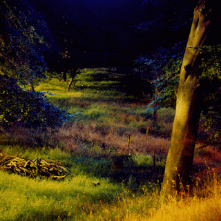

These two photos I have chosen from the 'Sharpes Wood' collection.
There are twenty three images to this series.

The first picture was taken at night  and leads the eye into the middle distance. The compostion has a tree lit by the flash in the foreground and then the light fades as it goes into the shadowy background. The picture is very haunting and the colour almost unbelievable. It could be from any time. I think that she has enhanced the colours to add to the drama. There are various shades of gold, purple and a cold blue. These works are viewed in exhibitions around the country. I would like to be able to use her work as a reference for some of my final images as I enjoy the ways in which she plays with light and colour. I am a fan of changing the Colour Enhancement.

The second picture that I have chosen in this series shows the cool reflections of trees in a woodland lake. Again this is taken at night and the depth of the background contrasts well with the muted greens of the middle and foreground. The picture is at one and the same time mysterious and yet soporific. The atmosphere is slightly unnerving as though the viewer is in a state of trance waiting for something to happen.

'Whitby' (Moonlight) 2010
This picture is number ten of a series of eighteen from the 'Chasing the Gloaming' collection. It is a beautiful photo of moonlight reflecting on the sea. Again it has the silhouette theme that I like and the lighting is so subtle that it almost looks like a painting. It is a very romatic and evocative photo and is almost mesmeric. The main colours are greys and silver with the silhouette lit by an orange glow.

'Green Circle' - Tree & Moon 2011
(This photo again is from 'Chasing the Gloaming').
This photograph is circular on a green/grey background. The moon shines low through mist and trees. This photo will have been digitally manipulated with the use of the frame. It would be ideal to digitally manipulate as the setting is almost fantasy. For this body of work the photographer was much influenced by Atkinson Grimshaw (a victorian artist). Dracup was inspired by his use of light, colour, subject and location.I find that the frame transports it from photo into a piece of art.


Researching - Bill Atkinson...

As a young child Atkinson cut out nature photographs from the Arizona Highways Magazine. He pinned them on his bedroom wall and this was his original inspriration to begin his life photographing nature. He spent forty years perfecting his art, always looking for that elusive hidden beauty to be found in nature. He photographs Landscapes and also Close-ups. He is a pioneer of Digital Printing Technologies and has passed on his expertise to many more photographers.

He was a member of The Original Macintosh Team at Apple Computer for twelve years, designing a lot of the user interface and wrote the QuickDraw, MacPaint and HyperCard software. He uses what he has learnt to perfect his own art, using the accuracy and creative control.


His Close-up pictures, mainly of stones, look very much like abstract paintings. He wrote a book using these photgraphs called "Within the Stone".

Artists Statement:
" Photography begins not in the camera but in the mind and the eye. The real work is one of noticing and appreciating, seeing things clearly and differently, and sharing that vision with others. I have developed my vision and my photographic craft in order to bring the beauty of nature to light in a fresh way that can inspire and nourish people." - Bill Atkinson.

1029 Quinault Rainforest - Bill Atkinson
This photograph is from the collection titled 'Pacific Northwest' located in the Olympic Peninsula, Washington on a Nikon Camera using a 35mm Format. I found this photo on his Official Website. The style is Documentary and brings the exotic to the viewer. The picture was taken in 2007. The photo is taken deep in the forest and shows a moss covered trunk as the main subject which is surrounded by various flora.  The light projects down form the canopy emphasizing the shadows and bringing out the different textures and shades of green, this being the prime colour.
It is a relatively close up photo giving a view of the dense foreground. There are 48 images to this series. He displays his work on the internet, in magazines and newspapers.

1530 Sunrise at Red Sands Beach - Bill Atkinson
This photograph is from the 'Hawaii' collection and the location is Maui, Hawaii. He has used a Hasselblad Camera. The photo comprises of a rugged Silhouetted Rock set in the foreground and a dramatic sunrise as the backdrop. There can also be seen Choppy waves crashing onto the rocks. This picture is full of romantic drama with fiery clouds hanging under blue skies. The silhoutte is in stark contrast to the colour of the background. This photo is full of power and emotion. I would like to take a photo in silhouette because I love the contrast between a flat outline and the movement of the sky or landscape behind. The effectiveness of this type of photo relies heavily on timing and requires quite a lot of patience and luck.

Friday, 16 December 2011

Researching - Ansel Adams...

Ansel Adams is a photographer who captured some of the most beautiful, inspiring and Grand pictures of the American Landscapes, and because of his art and his personal interest, helped to protect and preserve it.

Adams visited the Yosemite National Park in 1916 and fell in love with it, taking pictures on his first camera. He went back each summer working at various jobs and began to perfect his own style of photography. He was an acknowleged wilderness photographer by the age of 34 and was also brilliant in the Dark Room. He developed a set of guidelines for planning the exposure and development of negatives and this he called the "Zone System". This allowed him to control the contrast of light and dark.

He founded the department of photgraphy at The Museum of Modern Art in New York. In 1936, he petitioned congress to create a National Park in Kings River Canyon in California and his photographs of this area helped to convince the lawmakers to agree and the Kings River Canyon was made a National Park in 1940.


He was comissioned to produce a series of photos of the National Park System for the department of Interior Museum and produced 225 prints, now kept in the National Archives in Washington. The second World War stopped the project but some of these photographs were reproduced from negatives and these are of particular interest to me.

Ansel Adams 'Road'
I particularly like this one as I'm obsessed with the cloudscape while capturing images. I also like roads that lead to "somewhere". It leaves a lot to the imagination. I am fond of images that let you think and make up your own conclusions. I like the bluntness on the title ; he hasn't tried to complicate matters, he simply states the obvious and leaves the rest up to the viewer. The composition is positioned nicely, as it seems to be rather symmetrical.To me the distance stands out the most in this picture, it just goes on and on and on...

Branches in Snow - Ansel Adams
This picture is a close up of thin pine branches at the base of a tree, weighed down by snow. It is a balck and white photo taken round about 1932. It is part of the Yosemite Special Edition Photographs. This particular picture has been used in books and as prints. The reason I like this photo is that it veers away from the usual photos of vast landscapes that I normally like. Although it is a close up, I feel that there is plenty to see as it is very detailed. Looking at it long enough you could almost imagine it as a landscape. It provides a contrast with the other photographs that I have chosen for my research. I like the shape and form of the pine needles and the texture contrast.


His photgraphs are in black and white and far from simplifying the scenery, it adds depth and awe. The scenes are powerful and strong and have an emotional pull on the viewer. Great effect is made of the play of light shadow and it brings to mind how small mankind is when compared to the nature around us.


I would like to try and emulate his style but with the British countryside which is a softer and less harsh enviroment but which still has its mysterious and dramatic side.

Tuesday, 29 November 2011

Blurb...

A few lessons back I had a discussion with Marie on some different ideas on how to present my work for the final draft. Besides me choosing to do a woodland theme, I may try experimenting on something else aside. This being me creating my own book of Images that I took whilst venturing the States on my holiday and comparing the Landscapes in America to the Landscapes of Britain ( juxtaposing the two).

I could use the site Blurb and create my own book and then use this to display my images. For now it is only an idea as of course I have my Woodland theme to carry on with. But it is something I am interested in. Autumn over in America, particularly the states in which I visited is a lot different to how Autumn looks over here. Britain is much darker for starters and automatically looks colder in the pictures and maybe in some ways less modernised.

Below are just a few images of me comparing the two Countrys:


The First Image is taken in Britain whereas the Second Image is taken in America. Both were taken of sunsets coming to their end.


Derwent Water in the Peaks.

Another attempt at venturing across woodlands to try to capture semi-decent photos. This time I decided to get up at 5:30 AM and drive straight to the destination just in time for dawn break. Luck didn't seem to be following me however, as I chose to go out on the foggiest morning I have seen this year so far. Typical. I am a fan of foggy days mind...Just I couldn't really see anything in front of me, at all... in the slightest. Still, I carried on, determined to get some successful shots and hoping the fog would die out. It did a little...yay! The remaining fog gave the photo's more of an edge, so all in all it was a success. 


Checklist:

  • Charged battery and new spare battery the previous night.
  • Tripod intact. 
  • Manual guide for my specific camera in case.
  • Suitable clothing ( A warm coat, walking attire and Gloves!)
  • Plenty of space on memory card. 
  • Spare memory card.
I really wanted to capture some shots focusing on the Colour contrast. The whole reason I chose Woodlands/Forests for my assignment was to capture the tree populated areas and to show how they can change during one season on to the next. For example how the colours change and how a forest rampant with growth can change to a seemingly impotent skeletonised version of itself whilst still retaining a sombre beauty.


In these following three pictures I have changed the White Balance, Shutter Speed, Aperture, Colour Intensity  (on the last one) and ISO. I pictured the same spot just to show how you can create a different atmosphere just by changing the light exposure, colours etc. On all three of these photos I used my tripod (it is my new best friend).


                                        Shutter Speed: 3 Sec F/10 ISO 200 WB: Cool-White fl.


                                            Shutter Speed: 10 Secs F/22 ISO 100 WB: Cloudy.


                                             Shutter Speed: 10 Secs F/10 ISO 100 WB: Cloudy.
                            Here I intensified the red in my Filter effect options on my camera.
                         To me the colour contrast was shocking to look at and I wanted to show 
                          this as the colours didn't look as radiant once the photo had been taken.


                                       Shutter Speed: 4 Secs F/13 ISO 100 WB: Cloudy.
                             I took this photo on my Tripod but from a low angle to exaggerate 
                          the length of the tall trees compared to the small tree situated central.


                                         Shutter Speed: 1.3 F/5.3 ISO 400 WB: Cloudy.


Overall I felt I had quite a successful trip. I find one of the most challenging things is to try and take shots that are quite different from eachother. On one of my new outings I plan to take some of the different aspects of a forest besides the trees. I may also try to shoot during sunset to allow even more new exciting colours to come into the frame. I quite like the Idea of doing a close-up or an Abstract image in one of my final six photographs.
                               

Thursday, 24 November 2011

Researching Begins - Harry Callahan.

The Photographs of Harry Callahan that I am particularly interested in are a series of  landscape photos donated to the Philadelphia Museum of Art. They cover five decades of his work.


Callahan was inspired by Ansel Adams but was interested in the minutiae of his local landscape. His photos dwell on specific details of the landscape and become abstract in their attention to simplicity. The detail that he achieves renders the simplest things complex and forces the viewer to see that which he would not normally notice.


His choice of subject matter seems mundane and he often will photograph it twice.


Fig. 4 and Fig. 5 from 'Detroit 1942'.


For example the photos above are both of the Leaf on a section of snow. One was clear and pronounced whilst the other , though similar looks more abstract. His photos seem to invite the viewer to really "see" the subject. He offers us the ordinary and the overlooked and allows us to see it with fresh eyes. As John Szarkowski wrote, " He has demonstrated that the most accessible subjects, approached with the most transparent of Techniques, can be made new again each day by precision of feeling".

Callahan adopted Adams ethic of clarity in his own work. Adams was a founding member of the F/64 group, named for the small lens aperture, the result of which was called " Straight Photography". The idea being that the final photograph would be complete from every aspect without being manipulated afterwards. This raises photography to the realms of a pure form of art. He achieved this with a view camera purchasing first a 8x10" camera and then a 4x5" camera. The larger film allowed better image quality and for each negative to be processed individually.

At first glance his photos do not seem to offer us much to see, but on reflection they allow us to see worlds within worlds. His photos of Leaves, Plates 5, 6, and 7 Chicago appear to be the same, but upon observation they contain both similarities and differeces. The viewer is drawn into the texture, shape and the play of light and dark. Unfotunately I can only find one of these photographs to upload.

Plate 6. Chicago, 1950.


Another of his inspirations was Stieglitz and his cloud pictures titled " Equivalents" - which rather than being literal were more mood forming. If you look at Callahan's series "Ansley Park, Plates 34-37, shot looking upwards at trees and thier branches, you are drawn to the line and form rather than the knowledge that these are trees.

Ansley Park, Plates 34-37 1991.


I do have a fascination of taking pictures looking upwards, especially with trees. I think I have a few similarities in my own work to that of Harry Callahan's 'Ansley Park' photos. By transforming my own digital images into black and white there probably wouldn't be much difference except I tend to single out one tree.

Here are some of my own images.


Monday, 21 November 2011

Light Drawing Session.

A couple of weeks back we experimented with Light Drawing. I found that it is quite addictive. The only hard part is using your imagination to come up with new Ideas. We firstly had a go with the torches in the Studio. We set the cameras to Bulb Photography and then whoever would hold the Shutter down for any length of time that we needed to create an image with the torches/glowsticks etc. We all individually came up with some images to create and then we came together as a team to transform the images in the dark. For example we tried to do a boat out at sea on a summers day which I will display further on in this post. Each one of us would concentrate on just one particular part of the image to draw with the torches. After a couple of attempts I think we finally got there. Another picture we decided on doing was a Christmassy theme and so on...

Shortly after working in the Studio we ventured outside to see what other pictures we could design. We came across the park which was deserted and decided to use this as our base.


Monday, 14 November 2011

Effects...etc.

I've just been getting to grips with my cameras full potential and playing around with the different effects and all the editing techniques that can be done. Sometimes I find photographs need a little tweaking even though I do love an untouched photo. I've been getting used to using the White Balance also, which I love. I did not realise how much it can help with the photos atmosphere and the intensity of the colours within the photo. I have also experimented with the monochrome and Colour enhancement. By just changing some of these elements, the photo takes on a whole new personality.

I took some pictures indoors of a room before a halloween event. Changing the White Balance from Automatic made the photos take on a new feel.


F4.5
Shutter Speed: 1/200
ISO: 100
WB: Incandescent.


F4.5
Shutter Speed: 1/60
ISO: 1600
WB: Incandescent.


F5.6
Shutter Speed: 1/60
ISO: 1600
WB: Incandescent.


F4
Shutter Speed: 1/200
ISO: 100
WB: Incandescent.


Here are some pictures where I changed the Monochrome...


F5.6
Shutter Speed: 1/60
ISO: 100
Monochrome: Sepia


F3.5
Shutter Speed: 1/500
ISO: 400
Monochrome: Black and White.
Changed to Black and White as I think the lights reflection on the water shows up more and the city in the background holds a nice back drop. 
I like the composition of this photo. I think it is balanced out quite nicely. Changing it to sepia adds a bit more character. It also makes the picture looked aged.                                         

Thursday, 10 November 2011

Experimenting with the Studio Lighting.

A few weeks ago we had a little play around with making shadows in the studio by using various objects that we could find. Objects being Bottles, Shells, Fabric, Flowers, Textured Glass etc... We turned the main lights off with just a light focusing on the objects we had focused on. Here are just a few examples that we came up with...I hope you like. I think they look quite effective. The only problem I had with this task was trying be to be imaginative with the objects.


Monday, 7 November 2011

Trial and Error!

Right, a few days ago I went on my first woodland adventure to do with this assignment. I tried to be incredibly organised. I chose a fairly local Forest/walking area which was Cannock Chase. I used it mainly as a practice place. I was familiar with the lay out and just wanted to experiment the basics of photographing woodland areas.

Checklist:

  • Making sure my battery for my Camera was fully charged the night before.
  • Making sure I had plenty of space on my Memory Card.
  • Tripod already packed in the car.
  • Suitable clothing as the forecast was Rain, Cloudy and low temperatures.
  • Make sure I have my Camera Manual with me and any notes that I need.


I set off around 10:30 AM on my day off and manage to park in a quieter area. Luckily my day off landed on a week day so the Chase seemed to be a lot quieter than if I had gone at the weekend. The forecast predicted the night before seemed to be keeping to its promise with grey clouds looming above. Since I have recently discovered the White Balance on my camera this didn't worry me as I could change the settings accordingly. I tried to take some photographs without the Tripod firstly but this was proving to be difficult as it was a fairly dismal day and the forest seemed darker than usual. I had to really play around with the ISO, Aperture and Shutter Speed. I really wanted the colours of Autumn to show through my pictures so it was important for me to get the right lighting. After about fifty attempts at shooting the same spot I managed to capture the individual colours of different trees, plants, leaves etc. The lighting in the Woodland is so drastic in different locations that I had to keep changing the F number and Shutter Speed. I must have stayed in each spot for about half an hour just taking the same picture.

I then tried it out on my Tripod which seemed to improve the situation quite a bit. I was able to get a sharper image as I could slower the Shutter Speed and have a smaller Aperture. Below are some of my examples. Some I have altered and edited just to add more of an effect and character.


                                                     Shutter Speed: 1/160 ISO 400 F8 WB Cloudy


Shutter Speed: 1/100 ISO 400 F8 WB Cloudy
(Changed the Monochrome to Black and White)


Shutter Speed: 1/125 ISO 400 F7.1 WB Cloudy
(Monochrome changed to Black and White)
I like the angle of this photo as I think it makes an eerie effect.


Shutter Speed: 1/60 ISO 400 F5.6 WB Cloudy
I like the Colours on this photo; I think it looks like it could have been painted. The tree in the foreground seems to frame the picture slightly.


This is the same picture as above but I have intensified the Colours to make the picture look more defined. I think I let in too much light on the original photo.


Shutter Speed: 1/125 ISO 400 F7.1 WB Cloudy
As if was a fairly dull day, I had to play around with the colours afterwards as the natural light seemed to merge the colours into one.